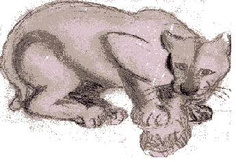
As for the graphic representation of images, the Netscape browser is sometimes unsatisfactory. Unlike Mosaic, which reproduces the image as scanned, Netscape offers two choices of approximation--either to dither or to match to the nearest color in the color cube. In some cases these approximations are acceptable, even quite good, in others not so good, especially when we're talking about the representation of artwork. A suggestion for viewing JPEG and GIF images which are not displayed as part of Web pages is to view them through a supplementary viewer such as LviewPro for Windows. You do this by going to the Preferences Menu and selecting a viewer under Helper Applications. (Remember to close the viewer after viewing an image.) A drawback to this method is that it takes longer to display images in the external viewer than within the browser.
But varieties of output and formatting are part of the nature of the Web. As I say in my Aesthetic Introduction , a work like this has no ideal form. And even if the HTML author did have complete control over formatting, there's no controlling the output--monitors, resolutions, the user's choice of font. I myself am using Times Roman while designing these pages; I don't recommend a sans serif face like Helvetica, which works fine on a page like the title page but doesn't work well as text.
The lion